Snacker - Theatre Snack Ordering App

Visual Design + UX Research
October 2022 - December 2022
Project Overview
Moviegoers have the ability to book their seats ahead of time to save time when they get to the theatre, but they still need to wait in lines to get snacks before the show.

Snacker's goal is to create an easy to use experience that allows users to place orders for pickup before heading into the theatre, and make the experience accessible regardless of language or location.
My Contributions
Completed as part of the Google UX Design Certificate program, I conducted user research and usability tests, completed a competitive analysis, developed personas, sketches, wireframes, mockups and both low and high fidelity prototypes of the final product.
User Research
Summary
I conducted interviews with a series of users about their wants and needs when it comes to spending time at the movies. This research resulted in two primary user groups of focus for the project : users who are concerned with spending time efficiently and users who are concerned with language barriers when ordering food.Other common concerns included the desire for more nutritional information when making selections, and the ability to spend more time with the menu before making a choice.
Pain Points
Language Barriers

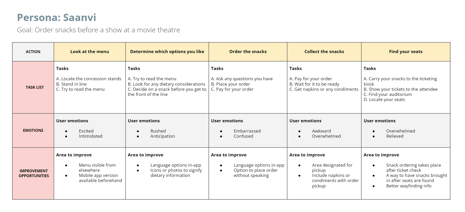
Many people in urban centers have varying degrees of understanding when it comes to language.

Time

Busy adults in this demographic are concerned with spending too much time on things that take away from the experience.

Information

A lack of information about food options makes it difficult to make informed choices.

Feeling Rushed

Users want to spend more time looking over their options before making a selection.

Persona : Saanvi
Saanvi
Age : 23
Occupation : Student
Hometown : Pune, India
Family : Single, lives with younger brother.
“I want to show my brother the city and have fun without worrying about language barriers”
Goals
  • Foster some independence with her brother
  • Remove barriers from accessing entertainment
Frustrations
  • Finds herself making decisions for both her and her brother for the sake of convenience.
  • Feels rushed sometimes in lines when she is translating/reading signs for her brother.
Saanvi is a college student living in Toronto with her younger brother Aadi. She needs a way to easily order snacks at the movies, because his English is still developing and the experience is intimidating.
Design Process

With my persona in mind, I wanted to get an idea for how the user might go about completing the core tasks that the app is meant to help with. I started with a Big Picture storyboard to get a zoomed out idea of how that might play out in an ideal situation with the app functioning as intended. This step was important for me, because it helped outline different steps that a user might take and gave me an idea of what pieces of information might be most important to include based on the environment.

Big Picture and Close Up Storyboards

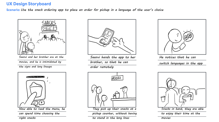
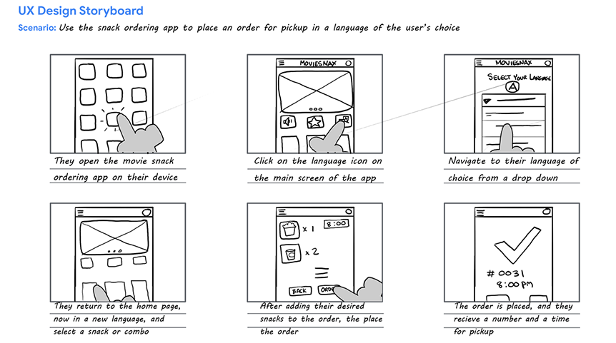
After I got an idea of the big picture, I zoomed in to focus on the user's experience with the app itself. This storyboard, a close-up of the situation shows the user (Saanvi or her brother in this case) using the key features I need the app to include. This step allowed me an early look into the layout and gave me an idea of where to start as far as a homepage and accessible features.

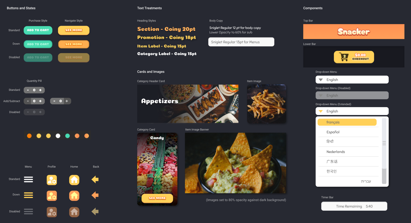
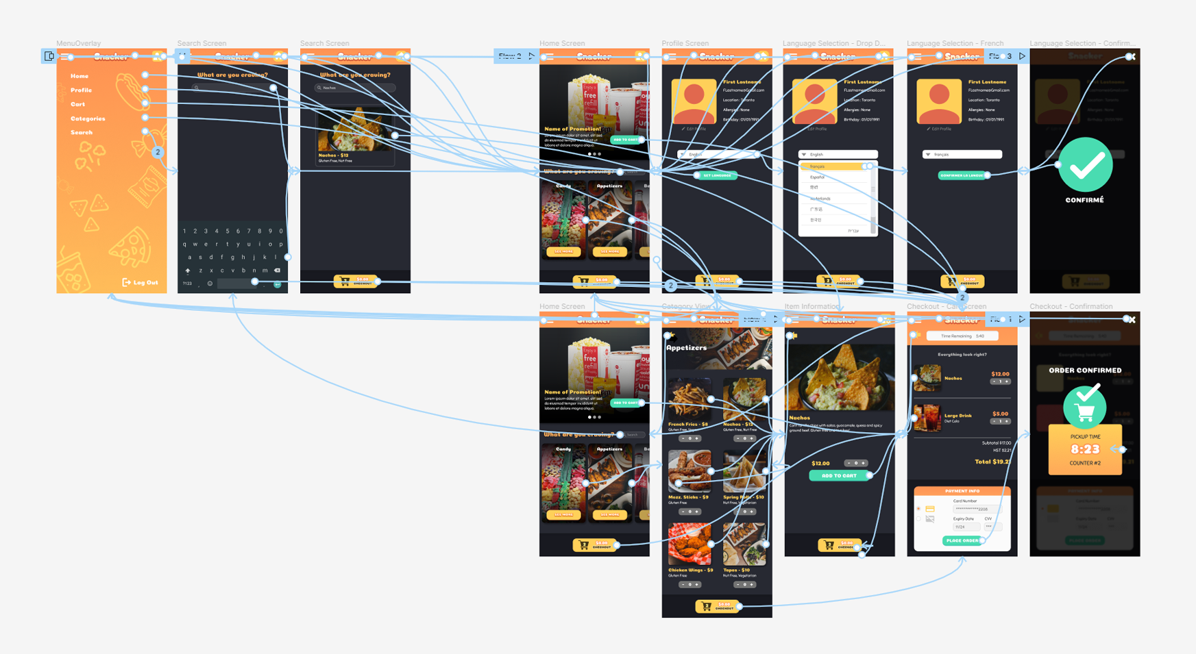
Drawing out some initial iterations for each screen helped me explore different layout possibilities for the language selection and checkout features of the mobile app. I started with a Crazy Eights warmup exercise to get some ideas down and then selected elements from each of the ideas that I thought were working well, and took them into consideration for the final wireframes.

Paper Sketches
Digital Wireframes

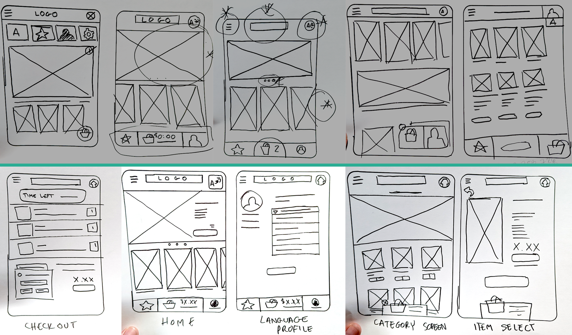
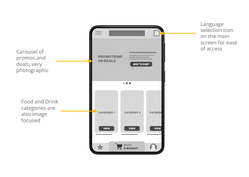
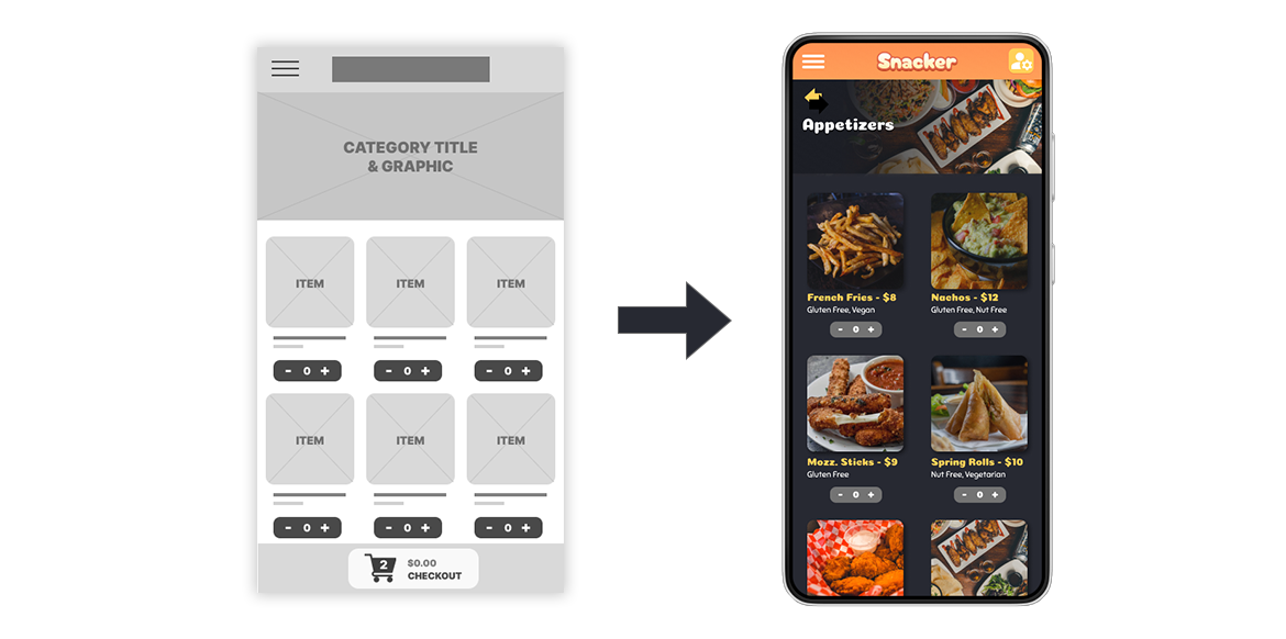
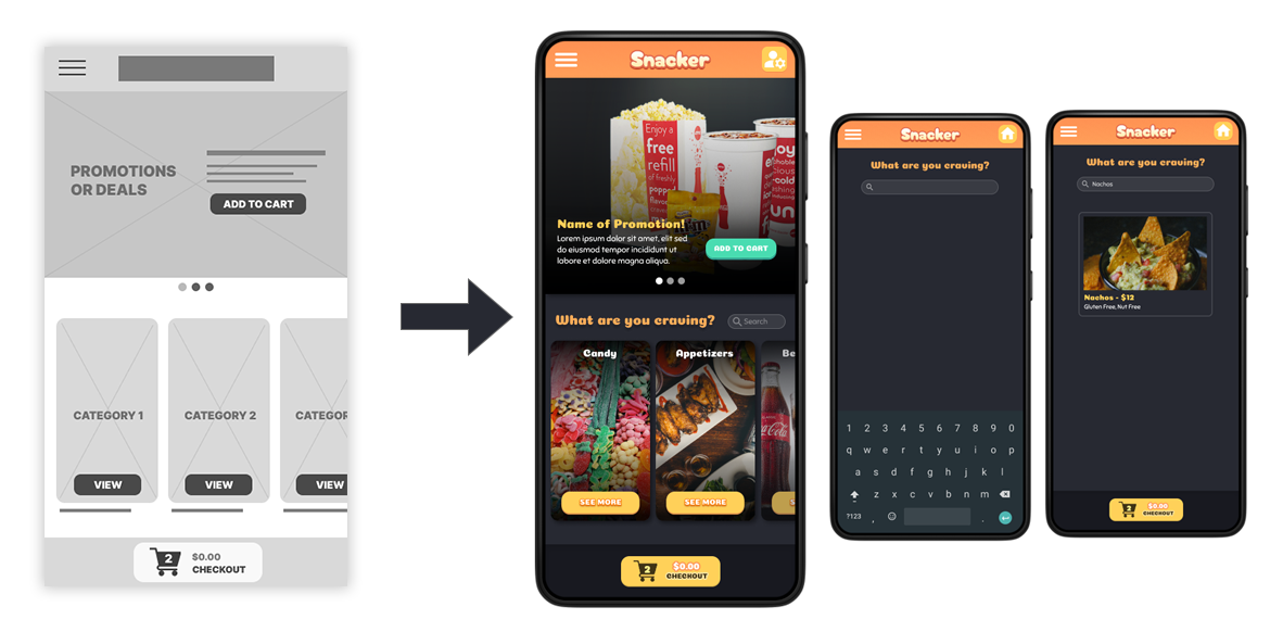
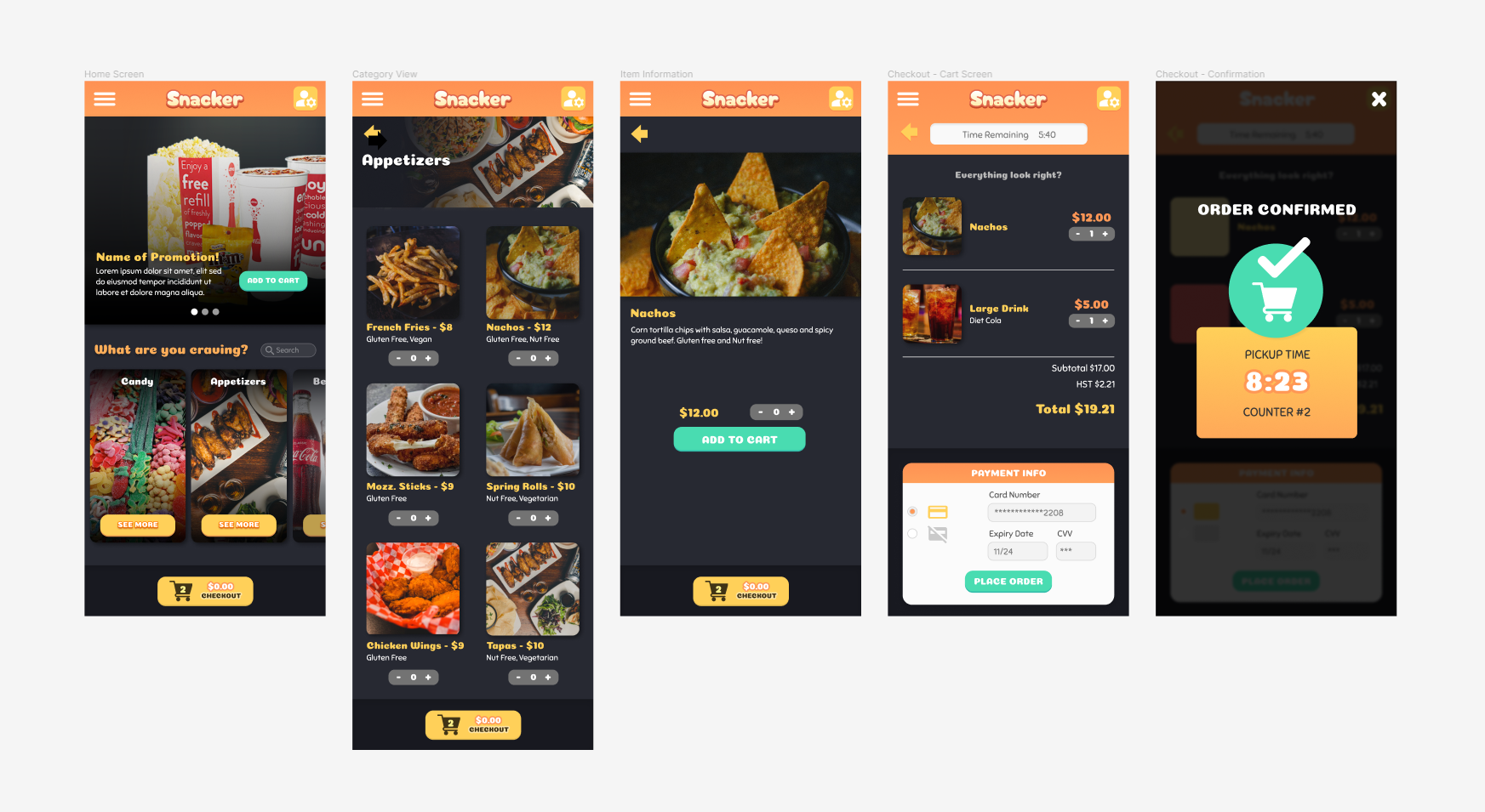
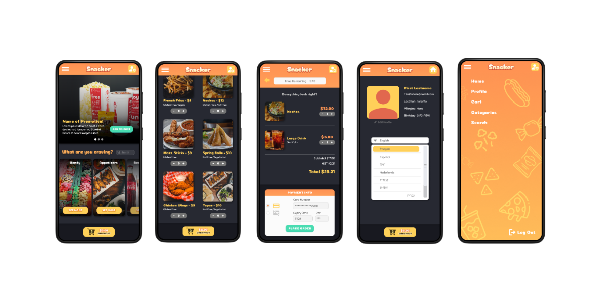
Once I moved to creating digital wireframes, I wanted to keep the focus on language options and an experience that is accessible to users with different language skills. For that reason I made sure that the language selection screen was front and centre, and the item categories and promo images focused on the food and drink themselves.

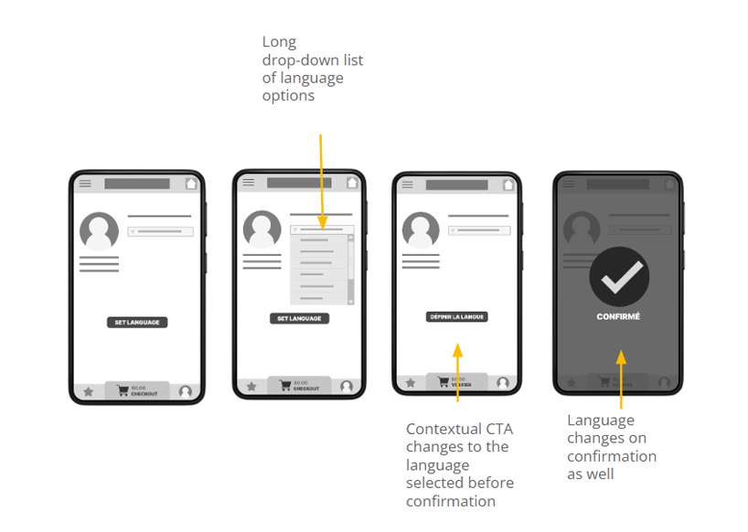
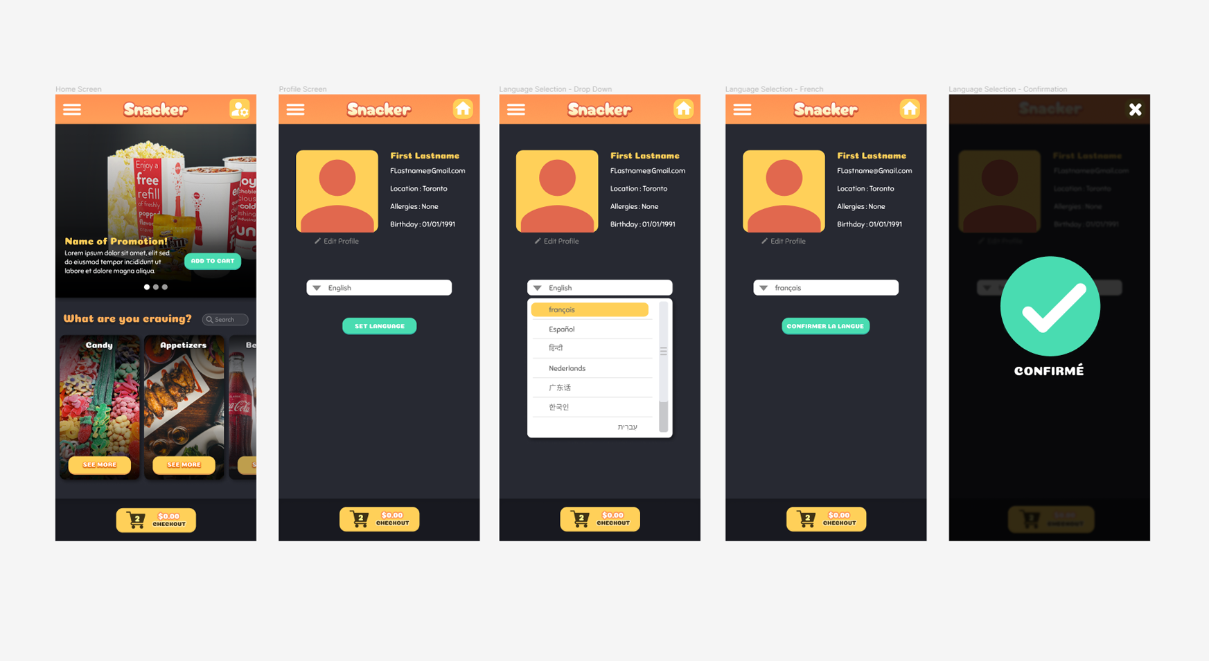
For the language selection work flow I wanted to ensure that the user would be able to read all of the CTAs and other contextual items once the language was selected, so the buttons and other labels on the screen change as soon as the language is selected from the list, allowing the user a preview.

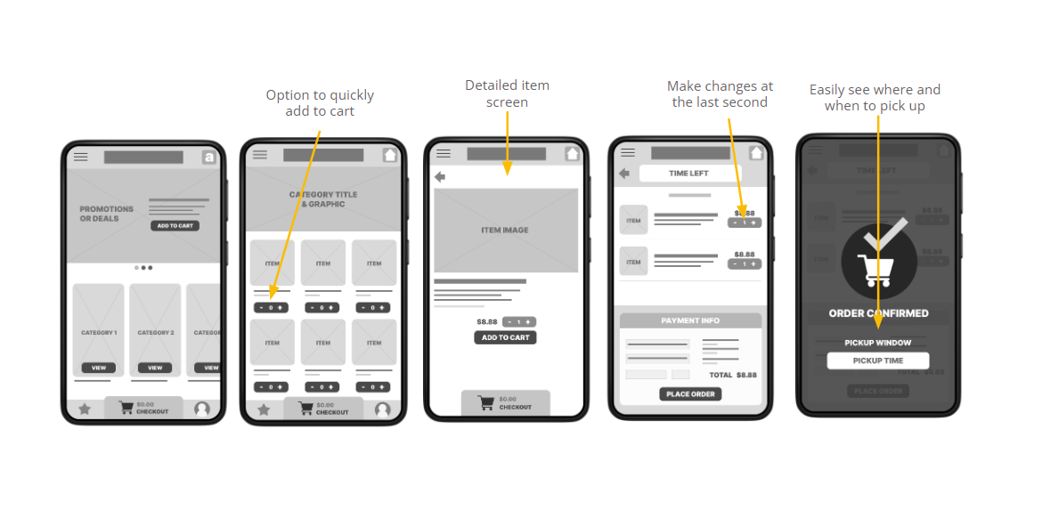
For the ordering side of the app, I wanted to ensure that the user would have plenty of information, but also had the ability to checkout quickly and easily. In addition to the promos on the main screen, each item inside of a category has a quick-add option underneath the thumbnail, which bypasses the item information screen.

Low-fidelity Prototype

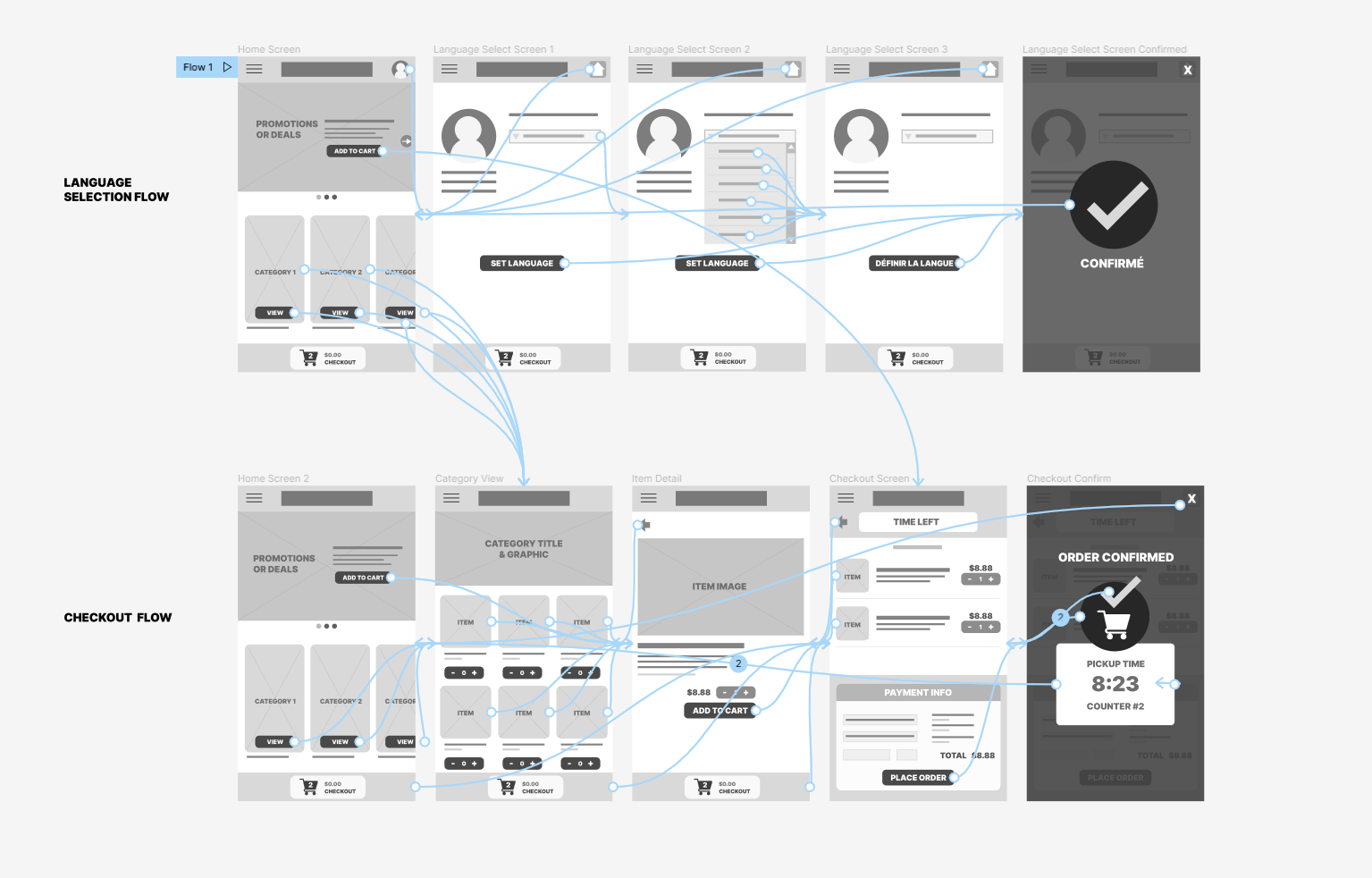
The low fidelity prototype for the snack ordering app shows the language selection workflow as well as an example of a checkout workflow.

Usability Study
Parameters

For the initial usability study on this project I wanted to determine if users are able to complete the core tasks within the app (language selection and order checkout). In order to better serve this research I included two participants who would prefer to use an app in a language other than English.

Format of Study

Unmoderated usability study

Location

Canada (remote, at home)

Participants

5

Length

2 Rounds, 30 minute sessions

Research Questions
  • Can users easily identify combos and popular menu items?
  • Can users who need to change the language do so easily?
  • Are users getting stuck at any point?
  • Is the process for picking up their order clear?

I considered Time on Task, Drop-off Rates, and User Error Rates when analyzing the results of the study and evaluating the performance of the app's intended uses.

The first round of tests resulted in 3 primary findings.

Users had difficulty locating language options

Round 1 Findings

The food selection area is cluttered

Pickup time/window information is unclear

After some minor adjustments to the prototype I conducted the second round of tests, which resulted in 3 new findings.

Users are looking for a search field

Round 2 Findings

Some text is hard to read

More promotions should be visible

Refining the design
Mockups
The second round of the usability study also revealed that users were looking for a search function, something that would make it easier for them to locate deals they were looking for. In addition some changes were made to text for legibility.
The earliest design focused on showing as much as possible on one screen, but after feedback it was decided that the items needed some more room to breathe. So when I moved onto the mockups I re-worked the design into a two column layout.
Visual design system
I wanted to ensure that the colour scheme was fun and bright, but also suitable to the main environment in which it is likely to be used (inside a dimly lit movie theatre lobby). The overall colour scheme of the app provides a low brightness experience that should be easy on the eyes in that darker environment. The text treatments have also been tested to meet accessibility standards, and contrast has been increased across the design.

Take a look at the Snacker App prototype!

Open Prototype
What I Learned
When you are designing something with a specific goal in mind (in this case language accessibility) it can be easy to overlook what should be obvious functions that may need to be added later (like a search function)

The final prototype made a good impression on the study participants, who said it was attractive, easy to navigate, and felt like it was designed with different users needs in mind. I think this was only the case because I made a point of reiterating on the design, not just based on my own design sensibility but on direct feedback from participants who would actually use the app.
Next Steps
The next step I’d like to take with this project is fleshing out the prototype to include more customization options and a more in-depth checkout process. Making sure that the language customization is scalable across all design elements would be ideal, and creating new mockups and prototypes for different device sizes.

Wanna work with me? Send me a message!