Cineplex App - Regionalization

UX and Visual Design
July 2024 - December 2024
Project Overview
Users of the Cineplex Mobile App have access to a variety of ways to narrow their search and find the movies or events they want, but a common pain point we were encountering was that users were being shown content that wasn't available near them, thus burying more relevant options.

As part of the larger Personalization project, the mobile app team at Cineplex was tasked with solving this issue by allowing users to set a region, which would help narrow the results they saw on their home screen, creating a better, more reliable experience for our guests.
My Contributions
As the Senior Visual Designer on the mobile app team, I worked alongside the UX designer in completing a competitive landscape analysis, and with the user research team in completing usability tests, analyzing their results and carrying learnings forward to the final designs, which were high fidelity mocks of the new feature, deployed in a new release of the app.

My focus was primarily on the overall look and feel, however I had the opportunity to delve a little deeper into the UX and research side of this project.
Competitor Analysis
Summary
Working with the UX designer on this project, we started to gather some data by doing a competitive landscape analysis. At first we limited our search to direct competitors but finding that we lacked enough comparative data, we expanded our search to include products that were similar in implementation, including online counterparts for physical retailers, and delivery apps that relied heavily on location functionality to determine the type of content a user will be served. We also looked at hotel chains, vacation planning and rental sharing apps, and travel apps.
Commonalities
After gathering a significant quantity of comparative information, we analyzed it and determined a few key areas of focus that the more successful examples we looked into took advantage of.
Location Map

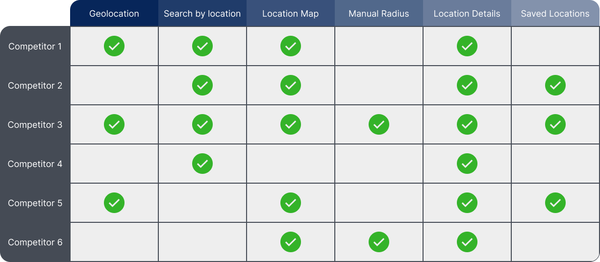
The ability to view locations on a map, as well as a list.

Location Details

The map should provide sufficient detail about the locations.

Search By Location

The ability to search for a location by name and/or city.

Saved Locations

The ability to save or favourite one or more locations.

Design Process

The first step in the process was to look at what parts of the app would be affected by an update as large as this one. We did an audit of every screen and feature in the app and determined which ones would have to be updated to accommodate this feature, and which ones would benefit the most from it. After we had a list of these changes we began to narrow our focus to determine which screens to create wireframes for, and what the user journey would look like in order to begin planning early tests.

App Audit and Planning

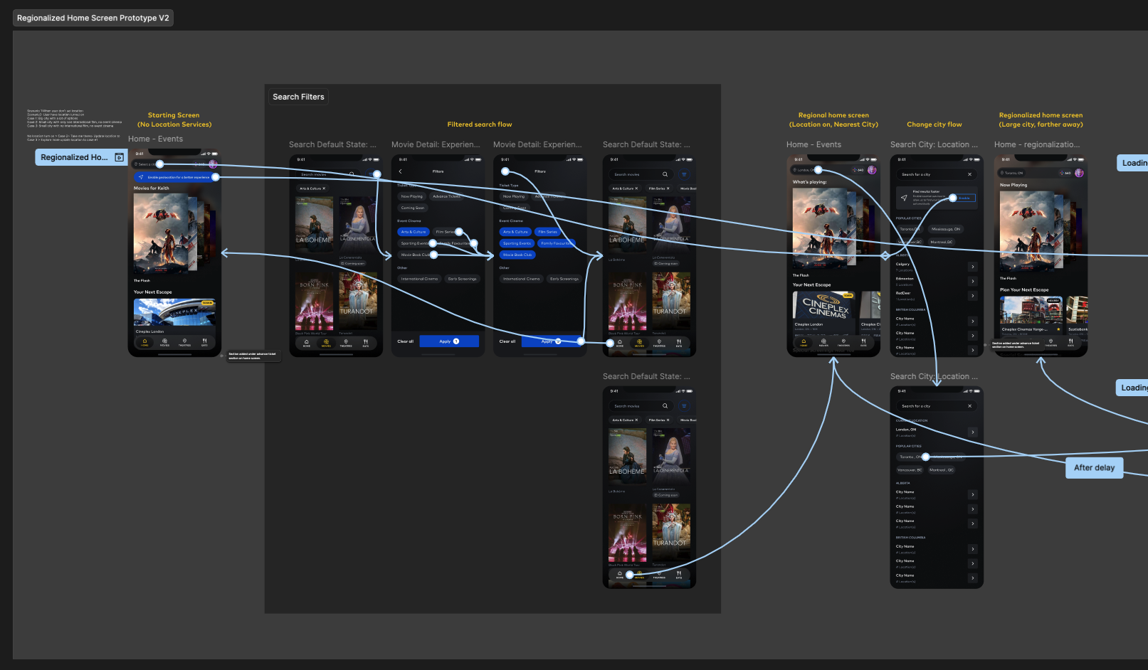
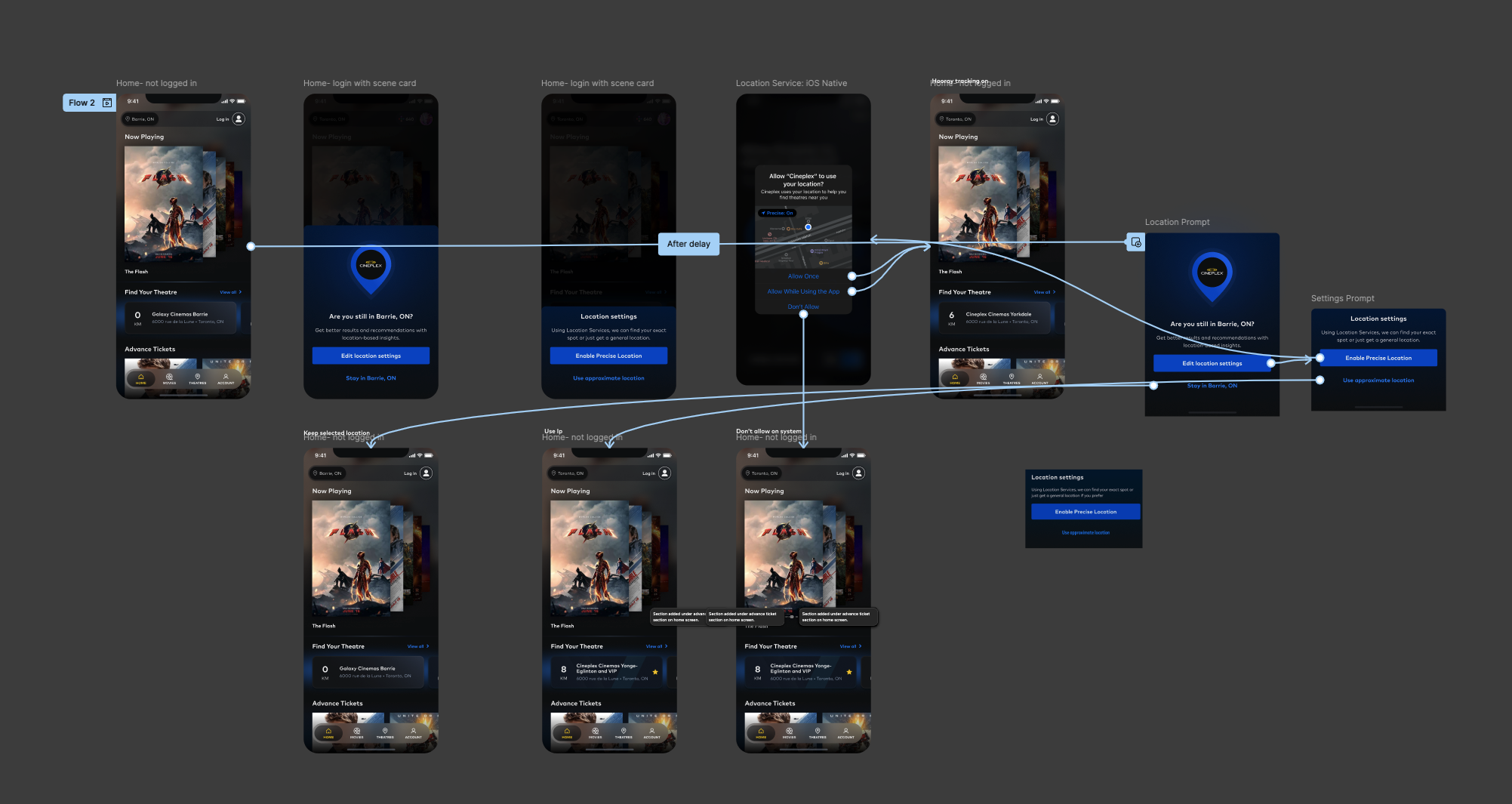
We decided to focus on two different flows for our first iteration, the first being the happy path - user allows location services and there are many theatres within their region - and a secondary path with more friction - user selects their own location, and they are in a more rural or remote area. After walking through some sketches and looking at our user personas, we needed to determine how this change was going to impact the app, how each user group would be affected, and what that would look like.

User Journey Maps

Because we were designing with an existing app we didn't need to worry about some aspects of the design that were locked in to our design system already. With that in mind we moved onto digital wireframes and began to lay out some of the screens we were thinking about building, looking at map functionality and preparing to get a low fidelity prototype ready for user testing. This part of the process involved a lot of back and forth between stakeholders, the larger design team, and developers to determine what would be possible for the MVP and what would need to be pushed to later updates. One of the realities of working in an active environment with team members who have different priorities is that you need to be flexible with what is delivered, but still try to maintain the best user experience possible.

Digital Wireframes
Screen Changes

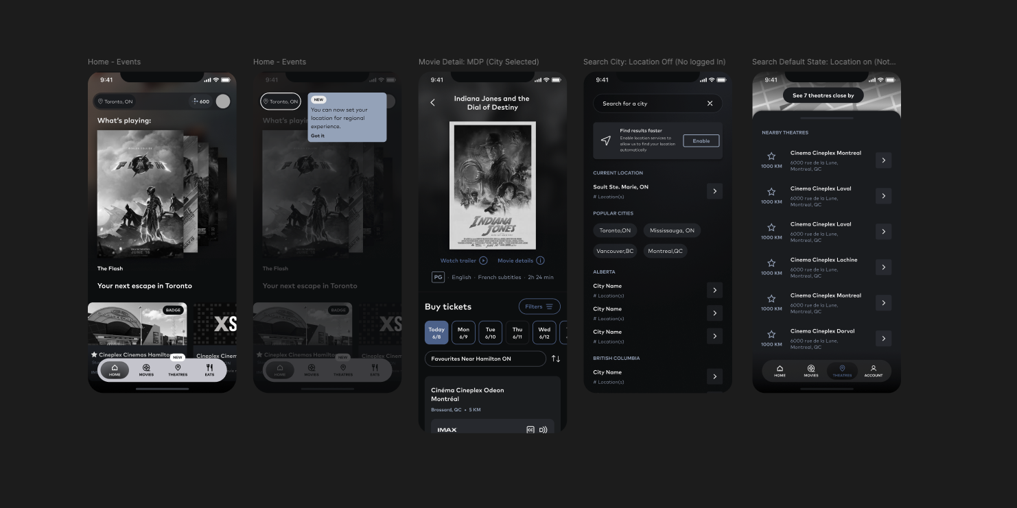
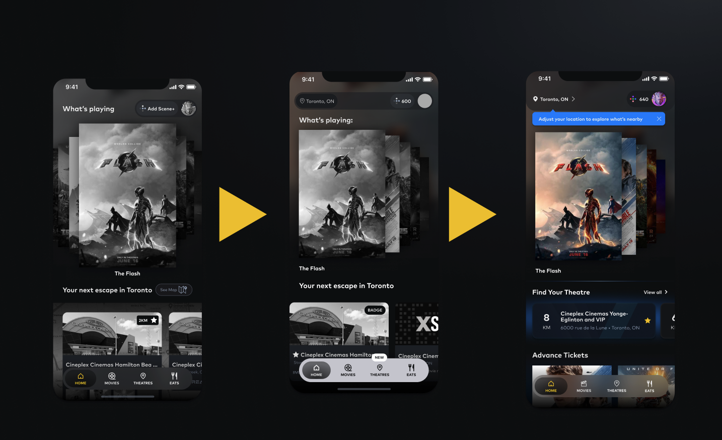
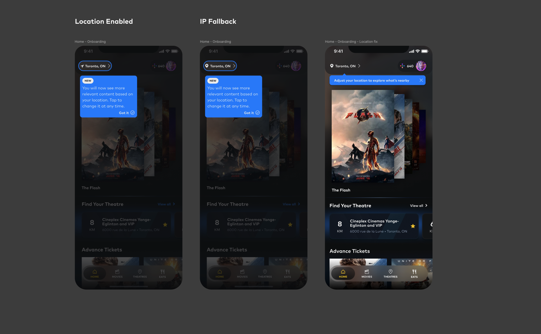
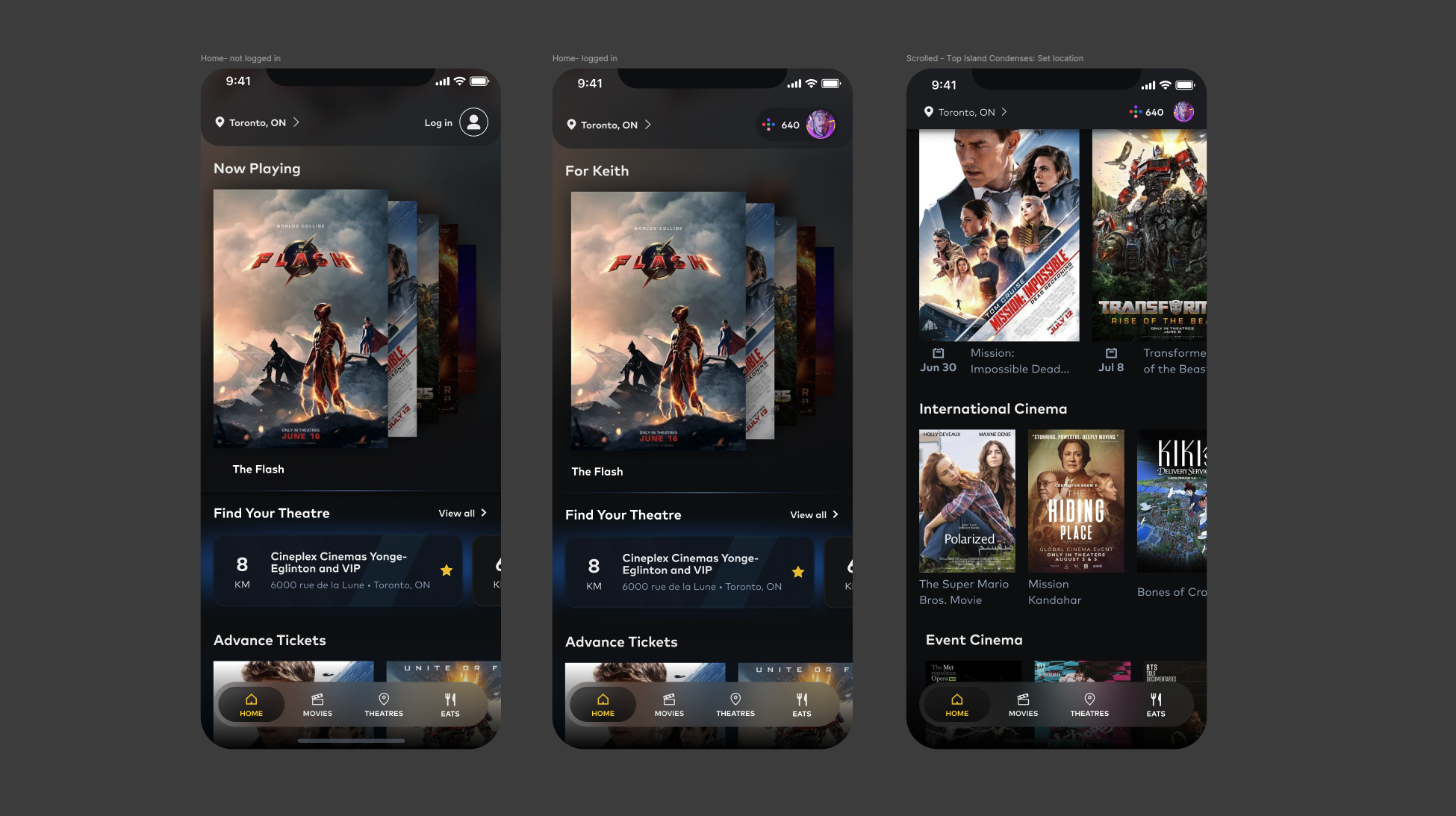
One of the cornerstones of this feature was going to be how it affected the user experience on the home screen, not only including content that is displayed to users, but also giving users a way to change their location easily and in a way that would be visible to them whenever needed. We looked at the idea of a bottom navigation element and the idea of an overlay, but in the end we opted for a top bar personalized element because it aligned with plans for future updates that we were in the planning stages for.

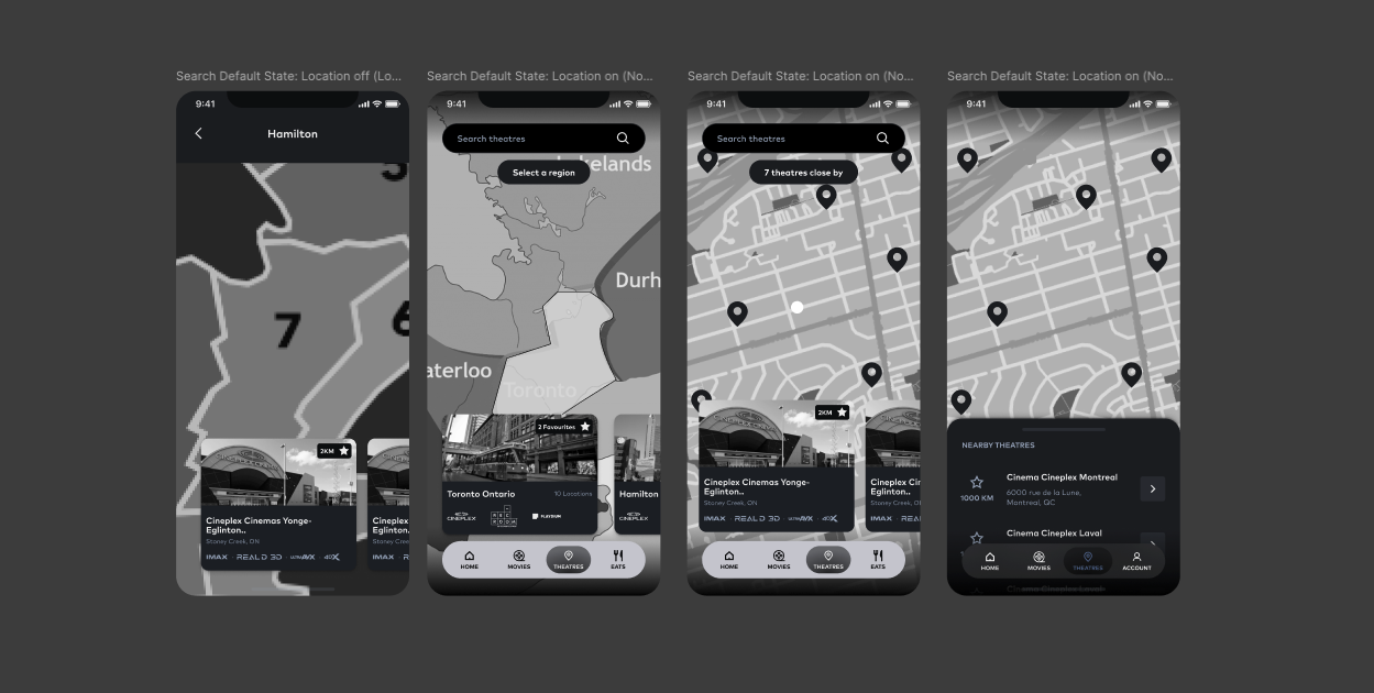
Once we had figured out how users would enter the region change flow, we needed to figure out how they would actually go about changing their locations. There was considerable back and forth here with the development team just to ensure that we had a solution for the map that would be functional at the scale we required, and we had to make sure we could effectively test it.

Finally we wanted to mock up the other screens that would include a regionalization entry point or component. Not all of these screens made it into the prototypes, but it was important for us to be able to visualize the concepts before we could be sure that it would work.

Mid-fidelity Prototype

The low fidelity prototype showing the happy path and some edge cases.

User Testing
Usability Study and User Interviews

Working with our UXR team, we put together a series of research questions and

Format of Study

Moderated usability study

Location

Mississauga, in-theatre

Participants

10

Length

2 Rounds, 15 minute sessions

Research Questions
  • Could users identify the location setting touchpoint?
  • Were users able to successfully complete the task of changing their region?
  • Having explained the benefits, do users find this functionality helpful?
  • Did users find value in seeing a map as part of this process?

We considered Time on Task, Drop-off Rates, and User Error Rates when analyzing the results of the study and evaluating the performance of the features intended uses.

The first round of tests resulted in 3 primary findings.

Users found the current version of the map to be unhelpful as it was too barebones.

Round 1 Findings

Most users said they would prefer the app to automatically adjust their location.

Most users said that they found the feature to be helpful, but hoped it wouldn't hide too many movies they wanted to see.

After some adjustments to the prototype - including a fairly comprehensive change to the map to add more context and make it more usable, another round of testing took place with some new results.

Users found it intuitive, but thought that the filter chips were unhelpful.

Round 2 Findings

Some users found it confusing to select a theatre, when they were mainly focused on selecting a city.

Users wanted to be able to tap a location on the map for more details.

Iteration and Visual Design
Design updates
Due to some constraints around what brand assets and technical functions we would require to deliver, some details needed to be removed from the map view - this worked out however as we had feedback that the map view seemed a little bit complicated. We put some features around theatre details on the back burner and focused on streamlining the view to make it easier for users to navigate.
The usability studies were overall positive, but they produced some interesting unexpected results that we wanted to address. We compiled a list of them and narrowed down which ones would be in scope for the launch version of the feature.
Visual Design
At the time of this project, our Design System was an active work-in-progress, so we were designing some components here for the first time, this included the onboarding assets, some new buttons and navigation elements. Overall we were able to align the feature with our design system and help to iron out some details in the process.

See this feature in action in the Cineplex App

What I Learned
Designing a new feature for an app that is already being used by a very large audience is daunting - you worry that any changes being made are going to be met with hostility - but if you can keep users in mind and focus on their experience first and foremost you can keep the app working the way they expect and improve it for years to come. The importance of the work done by our UXR team cannot be overstated in that regard and it's a great deal of the reason that the app is as successful as it is post roll-out.
Next Steps
Because this feature was so successful, we will be carrying the functionality forward into the web platform and improving user experience across our products. My hope is that once it is rolled out we can revisit some of those details we had to back-burner and make the feature even more rich.

Wanna work with me? Send me a message!